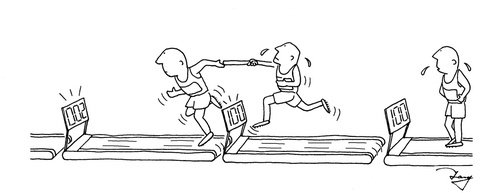
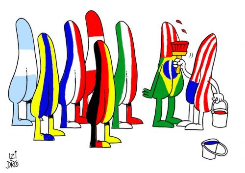
Around 40 cartoons were uploaded within the 70 hours, mostly new artworks in very different styles, mostly caricatures or portraits, but also funny cartoons and collages.
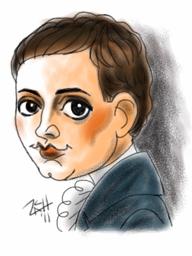
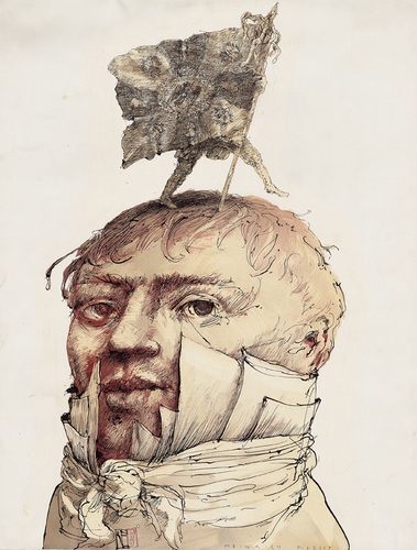
Juror Günther Emig, director of the Kleist Archives Sembdner in Heilbronn was very busy searching for his favorites and appreciated how many artists tried to “visualize” this one man, Heinrich von Kleist, the one who occupies Mr. Emig for years.
He couldn’t decide for 3 Kleist cartoons, so here are 6 picks with his comments (in random order):
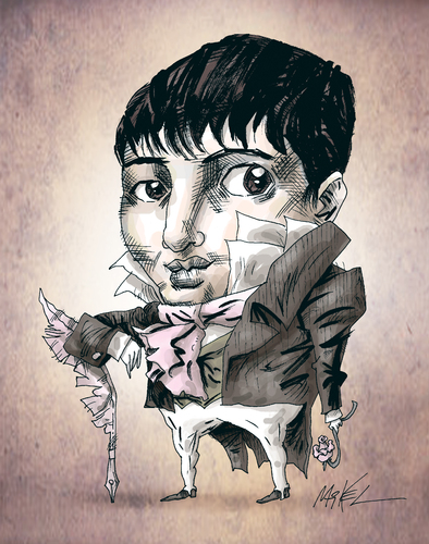
"One of my favorites. Big eyes, the hair combed into the face, historical outfit. And a distinct style – even if I didn't recognize Heinrich at once."
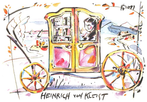
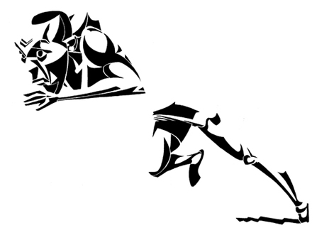
"Very nice artwork. Unfortunately in those times, mail coaches were convertibles, and when they went uphill, you had to leave the coach or even push it. Heinrich would have liked it this way."
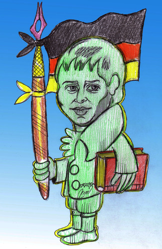
"I like it. Heinrich with a folder under his arm – no, it's a book – on his way to school. Brave guy."
Please check all submissions in this collection:
http://www.toonpool.com/collection?page=gallery&cid=1431
![]() Tang, In Memory of the Color of the Wind sounds like a really interesting book. Could you tell a little more about it?
Tang, In Memory of the Color of the Wind sounds like a really interesting book. Could you tell a little more about it?
The book is about my six years in middle school – from 1980 to 1986. There are some funny anecdotes but you can also learn a great deal about the important events that happened in China at that time.
Frankly, I have no idea what the early ’80s were like in China…
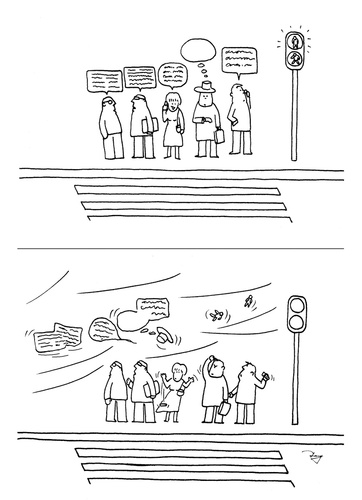 Looking at school life, there’s a big difference from the current system of education. Let alone from Western education. If you look at society as a whole, the early ’80s are a very sensitive period to China. They represented a key transition between the notorious Cultural Revolution and Deng Xiaoping’s policy of reform and opening to the outside world – which led to China’s booming economy.
Generally speaking, although the living standard was very low, people in the early ’80s had a certain charming simplicity – and they were much more energetic, more aspirant.The whole society was full of energy. One slogan or a single gold medal in the Olympic Games would render the whole society crazy excited.
On the other hand, since the law system was destroyed so severely [during the Cultural Revolution], crime rates were very high. This led to the first “Yanda” in 1983. Tens of thousands of criminals were executed who should not have been killed by the ordinary law.
Overall, China then was totally different from China as it is today, not to say different from the Western society. Sadly, many youngsters know nothing about these events, they forget the history. That’s one of the reasons why I want to write a whole series of books.
 I think that your cartoons look very Western. At times they remind me of Saul Steinberg’s work..
You are right, I like Saul Steinberg’s style. I am also impressed by Mies van der Rohe’s wisdom: Less is More. That’s why I like to use very simple lines in black and white to express my ideas. Also my spare time is very limited. I’d rather spend more time on thinking than on drawing.
Do you prefer this Western style to a more “Chinese” approach?
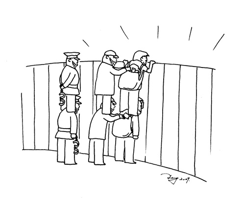
Actually I am still trying to find out which style is suitable for me. In my opinion there are two sides to “style”: a mental and a material side. Mentally, I am deeply influenced by Chinese culture. My cartoon “Thieves”, for example, was inspired by a famous Chinese idiom: The mantis stalks the cicada, unaware of the oriole lurking behind itself.
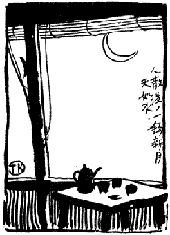 Materially speaking, you are right that so far I am sticking to a Western style… But I am very interested in trying a more Chinese style or in combining the two. I admire works like this one by famous Chinese artist/cartoonist Feng Zikai (right). The caption reads: “After guests have left, there only remains a crescent like water in the sky.” A very beautiful artistic conception – making use of both a Chinese drawing style and Chinese cultural tradition.
I know that this will definitely destroy a cartoon.. but I don’t get this one . Could you explain it?
If you knew more about Chinese culture, I am sure it would be easier for you to understand the cartoon. Feng Zikai drew this cartoon to express the artistic concept described in an old poem written during the Song Dynasty . “Chán” describes emptiness and quietude of space and time – the eternal instant or the instantaneous eternity.
You see the teapot and a couple of cups on the table. You can imagine that the guests had tea and talked and had a good time a moment ago. Now the guests are gone but the teapot, the cups, the table, the shade and the moon are still there. It’s just some simple black lines with plenty of white space, yet you can imagine a lot. You feel the calmness and the beauty. That’s the Chinese artistic conception. In a way this is a painting rather than a traditional cartoon.
Do most Chinese cartoonists stick with these kinds of artistic traditions?
Several Chinese cartoonists, especially the old generation, like to use Chinese brushes to draw cartoons. Yet more and more young cartoonists tend to draw in a Western style.
What is it that makes a Western style more attractive to younger cartoonists?
Good question. You know.. China has been in a process of a rapid change during the last thirty years. I think that the Western style of cartoons is attractive to them because today Chinese society as a whole is attracted to Western style – life style, working style, fashion style, etc. Especially the younger generations. The youngsters receive less Chinese cultural education than we did and they grow up with a lot more of Western culture.
The Western style is much more in demand.Therefore fewer cartoonists insist on the Chinese style, hence the quality of Chinese style cartoons decreases – it’s a vicious circle.
I think many cartoonists are influenced by American or Japanese cartoonists and many readers favor cartoons from these two countries. Unfortunately the traditional editorial cartoons are not easy to develop due to the political atmosphere. This means that entertaining or silly cartoons are invading society.
How do Chinese cartoon artists share their work? Are there internet platforms similar to toonpool.com or deviantArt?
There are some internet platforms that specialize in cartoon sharing like toonpool.com. One of them is cartoon.chinadaily.com.cn I used to post my works there but I no longer do since there are some shortcomings: You can’t comment on a cartoon and there are fewer and fewer viewers. But you can still find some useful information there.
Thanks for your time!
]]>
Today’s interview has a bit of a back story: A couple of months ago, I did a special on vector graphics. One of the artists I was planning to do an interview with was Xavier Salvador. Well… it turned out that he doesn’t use vector graphics at all. Of course I asked him, how he achieved his perfect black lines and shapes. Here’s his reply:
 For my caricatures I use a process I invented myself. Some years ago, I used to ink my drawings – but I felt that it would take me years to learn this technique. And I don’t have the time! So I tried this: I do the first sketch and then, instead of inking, I trace with very clean lines of pencil. I scan it, and I darken it in Photoshop. Then I fill in the spaces between lines. Finally, I color the non-white areas and.. voilà! It is a very simple yet effective process.
[click here to see a work in progress]
About half a year after my first attempt I finally managed to continue the interview:
Xavier, now that I know how your technique works.. Can you tell me how you learned to draw? Did you have any artistic schooling?
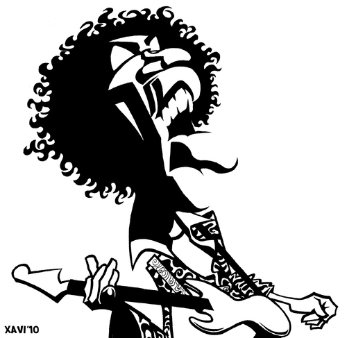 Yes, I studied technical drawing and engineering. This means I know perspective and volumes very well from my youth.
I drew my first caricatures back in university, and I noticed they looked pretty good. That’s why I decided to take a local ‘comic book course’ in my hometown, Reus. My teacher was Marc Sardà, a great illustrator and artist. He opened the door of this world to me, and I’ll be eternally grateful to him.
Do you still change things about your personal style?
Yes, I always want to try something new. Take, for example Matteo Bertelli‘s hair. I had never drawn Rasta hair before…So, I had to try out a couple of different ways of drawing it until I found the right one.
I think we always should try to improve. In my case, I developed from a ”standard” style more or less, to the current one. My objective is this: I want to communicate a maximum of content using a minimum of lines, colors and shapes. I think I have achieved this with the black-and-white style.
The most curious thing is this: one of the reasons that I have reached this goal, it is that I am color-blind – I am frightened of colors! And, obviously, I am more comfortable using black shadows.
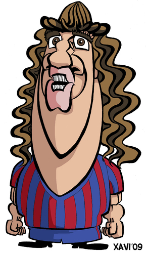 But you do have some colored works in your gallery.. How do you make sure you chose the right colors, say for the FC Barcelona jerseys? Do you memorize their position in Photoshop?
Yeah, you got me! I try to discern them from their position in Photoshop. I also ask my girlfriend to check the colors before I exhibit a picture. Coloring is the hardest part for me!
For some reason, I’ve never asked this question before: How do you decide on whom to draw next?
I like this question. There is more than one motivation to draw a person. Sometimes I like a piece of art created or performed by someone – music, a painting, or a film. Sometimes will draw a person I admire for their career. Or a historic character I have read about, or someone who is in the news. Other times, there is a request. And sometimes I just like the person I am drawing.
Did your new technique change something about the way you perceive lights and shadows?
Of course! I pay attention to light a lot more. For example, when I have to draw a caricature I reject a lot of photos that other artists would use. Why? Because they don’t have shadows, so I can’t see the volumes of the face. Without lights and shadows I can’t develop my drawings. For example, in my version of Michelangelo’s David, I applied a lot of shadows that you almost can’t see in any photo – but I need them to make my drawing live.
 How do you think your style improved over the last few years?
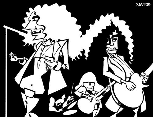
I’d say that now I do a lot more detailed analysis of my ‘victims” faces. I have also become quite meticulous about the shadows and volumes and I try to internalize them. In the last years, developing the style of fragmented shadows has been a step forward, for example in the Jesse Owens piece.
Is there something that you would still like to improve upon?
Yes, one of my weak points is drawing backgrounds, and I love drawing comic books! Therefore I must practice it…
As for human bodies and faces… I have worked with them for a lot of years now, but sometimes I still find another way of drawing something I have already done a thousand times! We can always improve, even on something we perfectly know.
Thanks for your time!
]]>Introducing…
 Achille Superbi is a new member fom Torino, Italy and a professional caricaturist. Most of the works he has contributed so far are very smoothly drawn and distorted in just the right way. There’s Germany’s Michael Ballack (ca. 2006), Bill Gates on a beach, Ronaldo during his AC Milan period, and director Pedro Amodovar, whose haircut really is that funny. I can’t really tell if Achille’s caricature of President Obama is a digitally distorted version of a photo – not that this would matter – but if so, Achille has added a great twist to it.
Cartoons of Interest
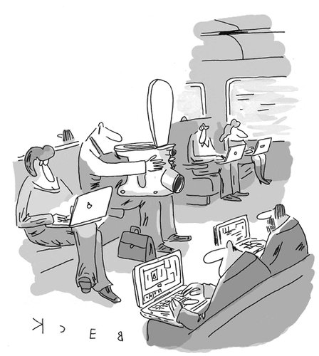 This week’ favourite is “Laptop” by German artist Beck (intl). It doesn’t really have a punchline, nor does it need one. Think of it as a slightly surreal snapshot. I fact, this would work as a real photo if only trains weren’t that expensive or toilets that heavy.
I have written about toonpool.com member Alves both last week and the week before that. And I’ll do it again: this time to point out the nice way of sequential storytelling he came up with (here, here, here & here). At least one of these cartoons has been published in Brazil’s MAD-magazine.. and it shows. Which means I don’t think it’s funny if you’re older than ten. But, again, the temporal sequence.There’s that interesting jump between the last picture and the one before making the whole story a flashback… and, since you can tell from the squiggly panels, I think you’re more eager to get to the final one than in a ‘normal’ narrative strip.
If you haven’t already, please also take a look at the ever-so-stunning work of British artist Russ Cook. I probably mentioned him before, but just look at the caricatures he’s contributed this week: there’s Liverpool FC’s Rafael Rafa Benitez, French philosopher Jean-Paul Sartre and Austrian composer Johann Baptist Strauss.
]]>I could also write about cartoons on the recent cases of sexual abuse at German Catholic schools. But then I would have to write about how the cartoons mostly perpetuate century-old Protestant stereotypes about Catholic priests. And there’s no need to do that.
Then I could write about the German goverment buying stolen data about tax evaders. I doubt, however, that this would be interesting to any of our non-German readers. But I just have to show this cartoon. I think this a great gag and after all the media coverage on Pirate Bay it should work for a relatively large number of people despite its geekiness.
In the end, I decided just complain about how that toonpool.com staff member posting stuff on facebook stole my ideas for the “Cartoons of Interest” section. First the Mondrian and then that novelty cartoon about 3D glasses. But you haven’t thought of The Bobble, Brain Access or the Elephant Busker. And you totally missed Exploding Charlie Chaplin. Because it has been posted TODAY! In your face, mysterious toonpool.com staff member.
Introducing…
 New member Kamil Yavuz is from Istanbul. He has created great collage-style portraits of Turkish politicians. The first one is definitely made from pieces of meat. Or so I think. His other work is more traditional – mostly coloured pencil drawings and water colors. I liked the massive cigarette, the astronomical tuba and the tiny knife. Or the over-sized USB plug – depending on your perspective.
Cartoons of Interest
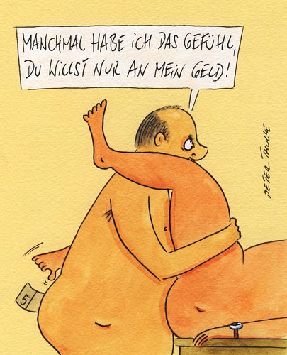
I found a cartoon that’s even better than the ones I listed above. The man says: “Sometimes I think you’re just after my money.”
Paul Hellmich
]]>On a lighter note: toonpool.com is proud to announce a newly-established partnership with Hannover’s Wilhelm-Busch-Museum. Founded in 1950, the internationally renowned institution today is Germany’s largest museum for cartoons and satirical graphics. One part of the collaboration will be an exchange between the museum shop and our own webshop – meaning that art by toonpool.com members will be for sale in Hannover. There are several other projects – so stay with us.
Cartoons of Interest
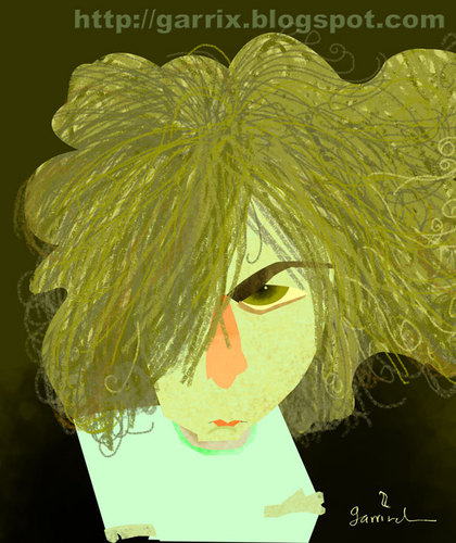 This week’s favourite is Garrincha’s amazing portrait of Pink Floyd’s Syd Barrett. His caricature of Django Reinhardt is almost equally great but the squiggly lines for Barrett’s hair made it a clear decision. Garrincha’s Tom Petty caricature is great too, ifact most of his caricatures of noted musicians are. But there’s a limit to the weblinks I can post without making this a pain to read.
I tried to find a decent cartoon on the China VS Google issue but somehow there were none. Everything I found was about censoring Google’s results, which I think isn’t really the point. So…, dear Reader, if you have a new and amazing cartoon on this complex issue or if I missed one : please tell me. I’ll be glad to add it to this post.
Paul Hellmich
]]>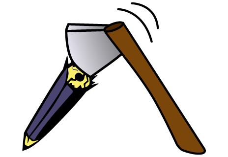
On January 1, 2009, an armed man tried to kill Danish cartoonist Kurt Westergaard. The Somali man had broken into Mr. Westergaard’s house carrying an axe and a knife. Fortunately, Westergaard was able to seek shelter in a specially-made safe room. The man was finally arrested by the police and has been charged with attempted murder on Saturday.
Kurt Westergaard was part of the so-called Muhammad cartoons controversy in 2005. His cartoon showing the Prophet wearing a bomb-shaped turban had been published together with eleven other controversial cartoons and sparked a wave of protest among Muslims.
We are deeply shocked by the attempt on a fellow artist’s life. Westergaard’s drawing may have deeply hurt some people’s religious feelings, but this does not justify violence and murder. Apart from being a terrible crime, the assault also meant an attack on the freedom of art, speech and expression. Toonpool.com condemns any form of violence and any attempt to curb the freedom of artistic expression by spreading fear.
We send our best wishes to Kurt Westergaard and his family and hope that they will be able to return to a normal life.
Newspaper articles:
Süddeutsche Zeitung, New York Times, Le Monde, Jyllands-Posten
]]>There are some cartoons that simply seem to refer to the fact that the assault happened and that it happened to a person no one in their right mind feels pity for (here, here & here). Others try to make the point that Berlusconi has finally felt the power of the Italian people (here, here & here), conveniently disregarding the attacker’s history of psychological problems. The weirdest version, by far, is this Jesus Vampire Freemason Berlusconi thing. Is his ear representing some shape I should know?
While some cartoonists draw parallels to the 2008 Iraqi shoe throwing incident (here & here), others link the attack to the Copenhagen Conference (here & here). To be honest, I don’t think that any of the cartoons is very good. Except for the vampire.. and perhaps this sexy-nurses-in-a-15-year-old-boy’s-room collage. Or these cartoons I didn’t understand because they are in Italian (here & here).
Cartoons of Interest
 Christmas is coming up, so this week’s favorite is another holiday-themed cartoon. Andreas Prüstel’s untitled cartoon ["So.. what are you?" "Same thing as last year."] nicely fits into my personal (and annual) present-finding terror. There is definitely a pattern emerging in the presents I give away. Come to think of it, there has been a pattern ever since I started giving presents away. Oh, well.
This week, there are some other great works I would like to refer to: Junior Lopez has created an amazing portrait of Sherlock Holmes; fellow Brazilian William Medeiros did this cool and classic caricature of architect Oscar Niemeyer. Finally, there’s Rex May’s cartoon about potentate-people relations.
Have a merry Christmas, a happy Hanukkah or a solemn and dignified Kwanzaa. That is, if you’re celebrating. Otherwise, have some good days anyway.
Paul Hellmich
]]>
Every time I re-read one of my blog entries, I will notice a couple of sentences that have a rather German structure. Sometimes I sneakily rewrite them, sometimes I just stay with it. I guess that these mistakes are something you can’t avoid when you’re not a native speaker and use your mother tongue all day. OK … these days I don’t do too much talking and I spend a lot of time reading English stuff on the internet. But you get the general idea.
 Similar things happen on toonpool.com’s main page. There are always one or two “official” sentences that sound a bit awkward. This is part of a dilemma probably shared by other websites. Toonpool.com aims at an international audience, so we need to translate the site into a large number of languages. Until now we support seven languages, which isn’t bad for a small company as ours – but there are obvious limitations.
Most of our localized versions are one-off jobs done by trusted native speakers. This means that there is no support for features introduced after the translation has been completed, let alone newsletters, etc. For those, we have to resort to our two ‘main languages’ German and English. We could have settled for one of them, but chances for international success are clearly better if you use English and it would have been a waste of our superior German language skills not to do a German version. Also about a third of the site’s visitors are from Germany. So, yeah.
Back to the awkward English dilemma: We are trying to set up a professional website for an international audience. I would go as far as saying that we are professionals – but we’re not exactly a large team. Any resources that go into writing nice and professional English texts could also be used to improve the site design, do general administration stuff and so on. On the other hand I personally find sites that use incorrect language somewhat sketchy. So it’s either trying to balance these kinds of things or leaving the international parts of the Internet to English speakers and companies with a budget for translators.
What does everyone else think? Did you notice any irregularities at all or is this something only a blog person with too much time on their hands will notice? How would you address the dilemma mentioned above? If you are an non-native speaker of English and have a website in English, do you experience similar problems?
Of course I know that this article somewhat misses the point for a number of toonpool.com users. There are quite a few who do not speak English or German and either write in their own language or trust the hardly-trustworthy Google translator happily ignoring all warnings. I keep wondering how you experience the site. Do you ignore all written text or just cope with the mysterious syntax of auto-translation? If anyone of you auto-translates this article, please tell me. Probably toonpool.com has some advantages in that a steady number of cartoons people upload is without words. But then again any comment or questions exceeding “very good” or “*****” usually leads to either Babel-ish chaos or uncomfortable silence. The lesson to draw from this is probably that the “discursive model” of web 2.0 communication is an idealistic and, ultimately, an elitist concept. There are other factors that generate internet community. I can’t help thinking and muttering to myself, however, that my old elitist ideal is more meaningful.
Paul Hellmich
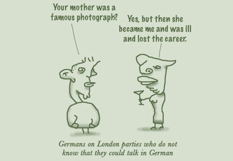
Image: London Party by Prinzparadox
]]>There has been, however, a remarkable accumulation of portraits showing two of the 20th century’s iconic posers: John Lennon and Salvador Dalí. As for Lennon, I simply forgot about the anniversary of his assassination on December 8. Be sure to check out some of the portraits. The most interesting one for me was this realistic portrait by Joachim Rick. Mullet-Lennon is a rare sight these days. Would this part of his image have survived if had lived? Probably not. Sir Paul has been pretty good in suppressing people’s memories of his mullet. Or of the fact that he used to have grey hair. Other interesting Lennon caricatures are these two by Doru Axinte, this blank-eyed version by Zed and Ben Heine’s triangular kitsch.
While the mystery about the Lennons has been solved pretty quickly thanks to Wikipedia, the forces behind the Dalís remain unknown. If anyone finds out why everybody did Dalí last week, tell me. As with most series of portraits, monotony develops amazingly fast – all the wide-eyed, mustachioed mock-madness, you know. So here are the highlights in quick succession: ear-hair Dalí, insane midget Dalí, Handface Dalí and geometrically deconstructed Dalí. Enjoy.
Introducing…
 Eoin Coveney actually joined toonpool.com last week. But he started uploading pictures only this Wednesday, so I think it’s OK to mention him here. Eoin is from Dublin, Ireland and he’s a professional. I really like the contrast between the furry cat and the smooth snowman in this one, or the line-art in this portrait. Peter Stringfellow turns out to be a kind of British Rolf Eden, if that’s any help to you. If it isn’t, take a look at Amy Winehouse in a psychedelic shirt or Dracula sporting a slipover. They’re both good.
Cartoons of Interest
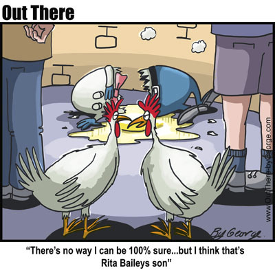
My favorite cartoon this week is “Son of Rita” by George. It nicely captures the two hens’ coldness toward H.D. Bailey’s great fall. I am sure that it will only take half an hour or so until everyone in the neighborhood knows what happened. Then, they will probably seem full of sympathy, but this cartoon unmasks their initial calculation: ‘Who is this’ and “Can I make a good story out of it’.
This is, of course, only my second-to-favorite Humpty Dumpty cartoon. It will be hard to beat Gary Larson’s classic one about how the horses want another shot at putting him back together again.
Paul Hellmich
]]>
