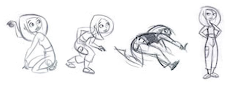
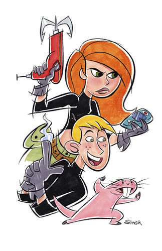
 This is the second part of our character design special (click here to read last week’s interview with Emmy winner and 2011 Annie Award nominee Gordon Hammond). Stephen Silver was born in England but moved to the United States to work as a character designer. Apart from being the lead character designer for cartoon series like Disney’s Kim Possible and Nickelodeon’s Danny Phantom Stephen also teaches online classes on character design.
![]() Stephen, you have worked as a character designer for several successful TV shows. Would you mind telling about how you got your jobs on Kim Possible and Danny Phantom?
Stephen, you have worked as a character designer for several successful TV shows. Would you mind telling about how you got your jobs on Kim Possible and Danny Phantom?
A friend of mine dropped off my portfolio at Disney and they called me in. At Nickelodeon, another friend had recommended me for the project. It’s good to have friends.
Did you already provide designs for the Kim Possible characters in your application?
Once I was asked to do some development on Kim Possible, I waited for the premise and a short “bible” [a reference document containing information about the characters] and went from there.
 Can you give a bit more information about this development process?
It all starts with a written description of the character. Some times there is more information, some times less. If the character is, for example, a certain kind of animal or from a certain time period I begin by seeking necessary reference. Then I present my sketches to the client for approval. I will take it to a final stage if that is what they are seeking.
What, in your opinion, is it that makes a successful character?
I think the most important thing that makes a character successful is if it has feeling and personality – without having to explain to the audience what the character is. It also helps if it comes across as appealing, good construction and pleasing design.
What is it that gives a character “feeling and personality”?
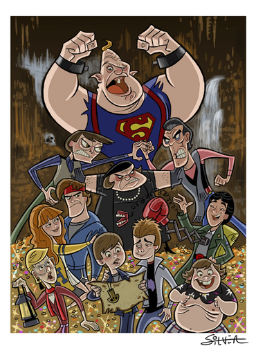 Three things: a strong line of action, movement, and a story behind the character. The more info I have on a character, the better. The more you know about your character, the more appealing it becomes and the audience won’t have to ask questions as to who or what this character is. They will see it in the posture, the eyes, etc….
One of the tasks when designing a cast of characters for a TV show is creating a unique style. When doing designs for different projects, this of course means having to create a unique design for each of them. Does this in any way interfere with developing your own, personal style?
I don’t think it interferes, I think it just creates a new challenge. As long as you draw plenty for yourself, you will develop your own style.
Thanks for your time!
]]>
Character design is a crucial part of cartooning. Whether a gag works depends to no small degree on the way the figures in a panel are drawn. This is even more true for the newspaper cartoons’ fidgety cousin: cartoon animation. The animation business and its tendency for rationalization has given birth to very specialized job description: the professional character designer.
In this two-part interview special, I will take a look at TV animation and try to learn more about the secrets of good character design. This week, I talked to toonpool.com member and award-winning character designer Gordon Hammond. Gordon works on series such as the long-running Fairly Odd Parents and a new show called T.U.F.F. Puppy.
 Gordon, you grew up in the Detroit area but now live in Los Angeles working as a character designer. How did you end up in animation?
After Art School I had been working as an illustrator and graphic designer. After about eight years the amount of work coming in began to get scarce. Several of my college friends had already moved to LA and were working in animation and feature film. I contacted them and they invited me out for a month to check things out.
During my stay I was able to visit my friends at work. One was at Disney, another was at Marvel Animation and another was at Rick Baker‘s special effects studio. They were all amazing places to visit and after seeing what they were doing artistically I knew LA was where I needed to be.
Did you find a job right away?
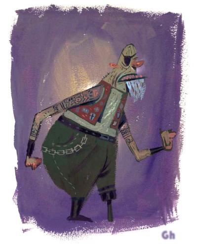 When I arrived in LA, I had to start over again having no real animation experience. I showed my portfolio around town a bit but got no response. One of my friends said prop design was the easiest way to get into the industry. So I sat down and started drawing what I thought were props: vehicles, helmets, planes, weapons and abstract 3-dimensional objects that showcased my understanding of perspective. I did this for about two weeks and accumulated a pretty good stack of useable drawings.
Shortly after, I got word of a job opening on a new show called Mummies Alive. I submitted my prop drawings and to my surprise I got a call the next day: They offered me a job.
I worked as a prop designer for the next 6 to 8 months and then made the jump to character design where I have been ever since.
What is the job of a character designer like? Can you describe the routines, your daily work?
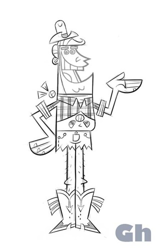 Being a character designer in TV is a lot of fun although it is very fast paced. We don’t get much time to work on our designs, the clock is always ticking.
As far as my daily routine goes in most cases I am working from the storyboard. The storyboard artists rough out the characters they need and then it is my job to work with those roughs and put them into the style of the show as much as possible.
Sometimes the roughs are pretty well worked out but sometimes they are as simple as lollipop heads. The designs that need to be done are called out by someone from our production team and given to me on a list. We usually get about 3 1/2 weeks per episode.
What kinds of designs do you do?
There are several different types. First, there are costume changes. The main characters quite often need to change clothes… Let’s say they travel to the Old West or turn into Vikings. Those all need to be designed.
Second, there’s facial expressions: This is when the characters make crazy faces, those need to be worked out. Related to this, we also design special poses. We try to work these out and make them as clear as possible for the animators overseas.
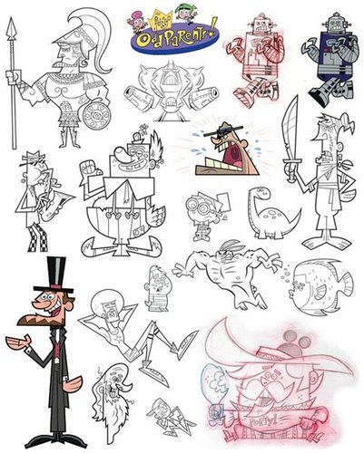
 Third, there are what is called “incidental characters”. These are new characters, some have speaking parts and some are just in the background. The ones that speak or get more screen time get more attention. They also need mouth charts so the animators overseas can see all of their mouth shapes.
A fourth type are crowd scenes. These are fun to do but they can chew up a lot of time. And they unfortunately only count as one character on my list.
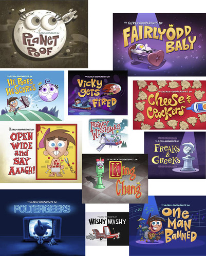
Finally, there’s title cards. The image that comes up at the beginning of the cartoon. These are always fun because you get to work out the typography as well as the image.
What, in your opinion, makes a good character design?
A good design is something that is visually appealing and makes you want to know more about him or her, it’s almost a story in itself. One of the first things I try to do is establish a clear and strong silhouette. This adds interest and helps the character read quickly.
Simplicity is also very important, keeping it simple is a must, especially in TV animation when everything is moving very fast. Other qualities of a good design are proportions and to avoid making the character too even or too predictable. Balance is important, too. Balancing complicated areas with areas that are more simple or sparse.
Do you have any favorite character? A character that you think is exemplary for good character design?
 Oh yes, I love the original Flintstones designs – absolutely brilliant! Designed by an artist named Ed Benedict. He designed most of the “classic” Hanna-Barbera characters. He is considered one of the true giants to this day. His designs were simple, charming and so original, but still very graphic, he really broke a lot of new ground for his time.
I also love some of the recent designs that Pixar has been doing. Carl Fredredicksen , the Old Man character from Up, I thought was just amazing. I also loved the Food Critic in Ratatouille.
What’s on your mind when designing a character?
Usually first and foremost I am trying to come up with something that is appealing, an overall shape that lends itself to the attitude I am trying to get across. Then I add the elements that the character needs to relate to the story little by little.
To put my personal stamp on things I will quite often think back to funny or interesting things I have seen in my life. Ever since I was a kid I’ve enjoyed studying and drawing people and I still enjoy it. Sometimes I create an incidental character based on someone I may have seen in the grocery market the day before, or maybe on my history teacher from high school .
In your blog you mentioned how the style of Fairly Odd Parents characters has changed over the years. I thought this was particularly interesting since it’s such a collaborative project and relies on a continuity in design. Can you explain how these changes develop?
 Most shows seem to evolve if they run for an extended period of time. The main reason is that new people come in and do things a little differently. Although it’s a collaborative effort there are no two people that are ever going to draw the characters exactly the same way.
As far As Fairly Odd Parents is concerned, when I first began on the show it was very flat and geometric and the color palette of the show was restricted to just a handful of colors. Over time we simply got tired of drawing everything so flat and slowly started to add more dimension to the characters. We began adding wrinkles and folds to the clothing and it opened up a whole new world, it was a lot of fun.
Around the same time some new background painters and color stylists came in and started adding more color to the show. As a result the show has really become more lush and vibrant-looking. So it has been a change for the better, although I’m sure some of our older fans would disagree. From the standpoint of having to work on it everyday it’s important to keep growing and changing just like in life, it’s a natural progression.
Are there any other fields of work, apart from TV animation, that you would like to explore?
Yes, I would like to do feature animation visual development. I would combine the experience I have built up designing characters for TV with my Illustration background. I think it would be fun, but the competition is tremendous.
That… and I would also maybe like to take a stab at live action production design. Some of my friends do that up in San Francisco and they love it.
Thanks for your time!
Next week’s interview is with Stephen Silver who worked as lead character designer for Kim Possible and Danny Phantom.
]]>