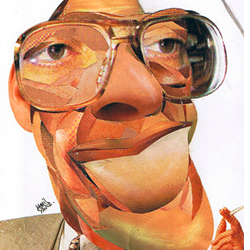
 “Turkey Types” By Kamil Yavuz
Kamil Yavuz from Istanbul has created a series of photomontage caricatures of Turkish politicians. I can’t really tell if they resemble their subjects because he didn’t provide any names and because I am far from familiar with Turkish politics.
Still, these portraits look amazing – the different textures and perspectives and the blown-up details work together perfectly. Please also note the animal familiars assigned to each politician (the guy to the left has bees) If anyone knows what this is about, please drop me a line.
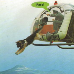 “Hundsgemein” by Andreas Prüstel
I have to admit that Mr. Prüstel is my favourite collage artist on toonpool.com. I guess it’s a mixture of his humor (by the way: the caption reads “Bite!”) and the retro feel of the collages.
The photos Prüstel uses are usually dated and slightly yellowed – if they are in color at all. Following the aesthetics of the Dada artists, these cartoons do not try to create an illusion of (sur-)reality but emphasize the incongruency of the elements pasted together. They would work great in a Terry-Gilliam-style animation.
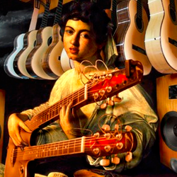 “Music Has No Age” by LuciD
Romanian artist LuciD has a very different approach. The elements of his digital collages are blended together perfectly. Just look at the way he added the Ovation double-neck to Caravaggio’s Lute Player. I bet she is playing “Stairway to Heaven” and annoying the hell out of the store owner.
As with many of LuciD’s works, I wonder where he took the photos from. From my own experience I know that finding stock photos in the right angles takes a lot of time. So perhaps he takes the photos himself. Which may also take a lot of time.
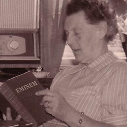 “Modern Times” by Prinzparadox
Creating this collage, on the other hand, didn’t take too long. The artist added a single word. But the minimalism makes the whole thing work. There is more here than the contrast between age groups and the questionable comedic value of totally radical senior citizens.
Please note that he book she is reading is not a book about Eminem (like, for example, as “The Way I Am” by Eminem). It’s Eminem, the book. Or the Book of Eminem. This is serious business.
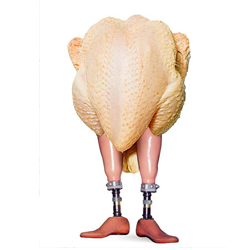 “Let’s Dance!” by Willem Rasing
Not much to say here, really. It’s a chicken with prosthetic legs and it’s about to shake them. This has been proven to be funny as early as 1986.
It’s the grotesque jusxtaposition that does it. On one hand the plucked cadaver looks awkward and vulnerable, like naked people. People dancing in the nude are funny. Things dangling, and all. On the other hand it is a cadaver – dead meat (OK… poultry). And those legs.. they are meant for mutilated people. With stumps. Probably victims of land-mines, punji sticks or thalidomide. Being reminded of mortality and the fragility of our bodily integrity gives pretty much everyone the creeps.
PS: click here for a collection of photomontages , and here to see all cartoons marked as “collage” (some mislabeled images)
PPS: You can now follow me on Twitter
]]>