Francisco Munguía is based in San José, the capital of Costa Rica. He is a full-time cartoon artist doing newspaper cartoons, paintings, ceramics murals and even computer games. Francisco and his wife Debora live together with their two sons and 25 dogs.
My first interaction with Munguía took place about a year ago when I messed up his first name in an article about cartoon parodies of famous works of art. I have to admit that this still bugs me. Here is a proper interview:
![]() Francisco, you often quote well-known paintings in your cartoons. Can you tell a little bit about that?
Francisco, you often quote well-known paintings in your cartoons. Can you tell a little bit about that?
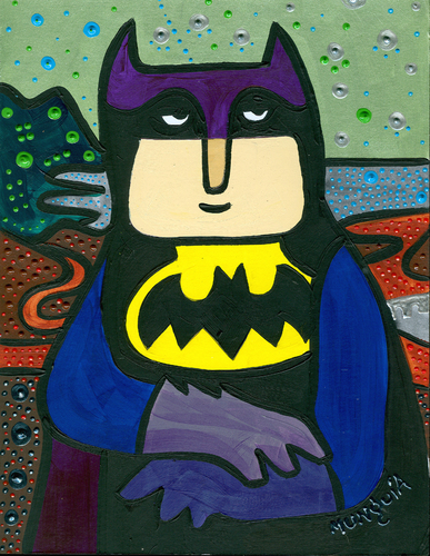
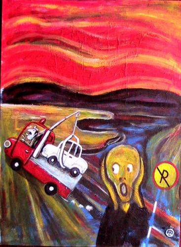
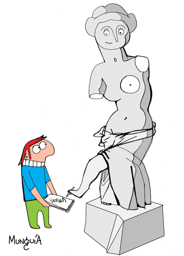
You’re right. Parodies of famous paintings make up for the greatest part of my “Calcamunguías” series. By now I must have done more than 200 of these reinterpretations. I prefer to caricature a work of art rather than politicians.
People from Guatemala, Holland, Korea, Ghana, or Spain easily recognize the Mona Lisa, or Munch’s Scream, but I think they hardly know the name of the president of my country. Chances that it will still be like this in 100 years are very high.
So, people like the parodies?
Yes, I started this series in 2008 and it became very popular. I even managed to organize a traveling exhibition of several rooms. Humor and parody are a great way to bring universal art to young audiences. In each exhibit my paintings are accompanied by a photo of the original painting, and the names of the piece and the artist. I also use the paintings to carry forward messages of animal welfare, ecology, and social interest…
While I love art, lots of paintings often seem boring to me – without humor and color. I’ll arrange that. My works are an upgrade, so to say.
What exactly do you mean by “boring”?
Over time, art has become more colorful and humorous, less realistic in form and more realistic in content, Michelangelo was gifted but his themes are limited by religious mythology. Rembrandt is a great artist but I do not like the many shadows in his paintings. Goya is extraordinary and very critical, but his works are void of color and the humor is very black.
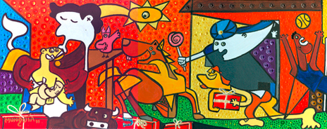
I prefer the toonpool cartoons to Mona Lisa, but I enjoy Mona Lisa much more than CNN news. The best example I have is Guernica, one of my favorite paintings – a large painting, very critical, but all the characters suffer. It’s gray, it’s sad, and it is a cruel reflection of war. My version is happy and optimistic. The family is celebrating the birth of the child, they live in peace surrounded by animals. It is full of color, like an exorcism of the original.
Still, there must be something you like about the original paintings.. right?
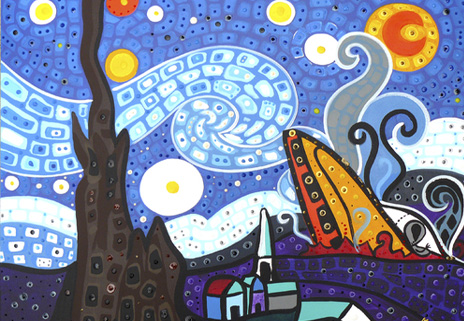
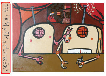 You can learn many things from works of art from the past – composition, color, history, allegory, symbolism. But I prefer the more recent artists: Van Gogh, Picasso, Duchamp, Magritte. The latter being very colorful, very symbolic, and very close to cartoons.
How did you decide on the color scheme you are using?
Costa Rica is a very colorful place. This has definitely influenced my art. I use a preset color palette when working on the computer. In my paintings I am more free. I use intense and plain colors, I will create texture by overlapping spots, dots and drops of pigment. I hardly ever use shadows – I am all for day-life, I love the light. Coloring is the most spontaneous part of my work, it is like a game.
Your cartoons look as if they are done very quickly. Is that true?
I am a fast artist. Coming up with ideas may take some time but I have so many in line that I have more ideas than time to realize them.
Some of my drawings take 20 minutes from the white sheet to adding color on the computer. I am even faster when I do several pieces at once. I can paint up to three pictures at once and finish them in one day.
 I paint murals of 30 square meters in four hours, but my ceramic pieces, for example, take me a couple of weeks. My largest mural took me two weeks with the help of one assistant. But there was also one that lasted two months. It was a pedestrian bridge that was painted underneath, inside, outside and everywhere. I needed cranes, extensions and several assistants for that one.
What, exactly, is the jobs of the assistants?
For my murals I cooperate with the community where I paint. Neighbors join the production as volunteers. Often they will ad the colors to the drawings – sometimes even little kids will paint a small piece. This way they become part of the art and the neighborhood improvement.
Other things assistants will do is to clean my brushes, put the paint into little containers for the use of volunteers. I am responsible for all drawings, for the coordination, I will fix errors made by volunteers and will finally add all the lines that define the painting.
Which do you like better – the murals or the small formats?
It’s hard to choose. The mural brings me closer to communities, but in the smaller formats I can do at home even if it is raining. The decision for “micro” or “macro” depends on the needs of the moment, and my time. Also the murals need sponsors, the small formats don´t.
Thanks for your time!
]]>
Some time ago, I mentioned several collections on fine arts found on toonpool.com. Inspired by the amazing art spoofs by Costa Rican member Francisco Munguia, I decided to take a closer look at humorous versions of famous paintings.
Modernity and Spoofs
While I am not an art historian, I think it is safe to assume that parodies of visual art gained a great deal of importance in the 20th century. For a spoof to be effective, after all, people must be familiar with the original piece of art. Painted copies as well as engravings of works of art may have been available before. Photographic reproduction, however, vastly increased our repertoire of shared images and thus the number of people who would “get” a parody. As a result of this development and of the continuing democratization of publishing processes, the number of parodies itself increased.
Types of Spoofs
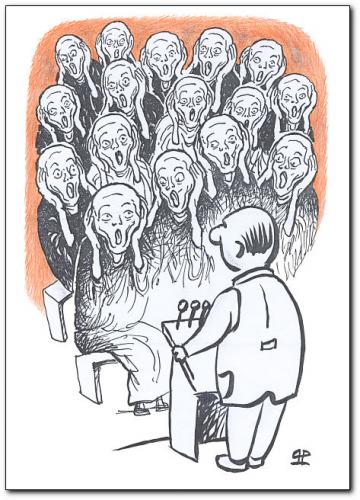
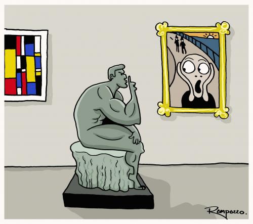
The most frequently spoofed painting on toonpool.com is Edvard Munch’s “Scream”. This is likely not only a result of the original’s fame but also of its cartoony-ness. The Scream Guy is, after all, easy to draw. The spoofs can roughly be divided into three categories. In the first category, the artist changes the content of the original image (e.g. here, here & here). In many cases this is restricted to only a few elements of the picture, but at times the whole painting is being reinterpreted (e.g. here & here). The second category consists in artists putting one element into different situations outside the original setting (e.g. here, here & here).
Spoofs of the third variant, finally depict the iconic image as a piece of art inside the cartoon narrative. Sometimes it is contrasted with other famous pieces of art (e.g. here & here).While “type one” is probably more frequently used than the other two, there is always some variation depending on whether the original image is suited for a particular type of parody. Take Michelangelo’s “Creation of Adam” – another favorite when it comes to parodies There are much less “type two” spoofs because it is not as easy to single out an element like Munch’s Scream Guy (there are some examples, though: here & here). There are a few “type threes”, too (here & here), but the majority is clearly “type one” (here, here & here).
Why We Spoof
The formal typology above is very likely incomplete and may have other flaws, too. It illustrates, however, the basic strategy of parody: artists introduce a new narrative, while the original narrative of the work remains in recognizable in the paintings’ visual elements.
Apart from the “joy of recognition”, I would argue, some of the pleasure we derive from looking at an art parody, stems from a playful questioning of the original piece’s authority. Sometimes the purpose of this attack is merely a gag (as in this version of Rembrandt’s “Anatomy Lesson”), sometimes it also includes a comment on our society, politics or even humanity as such (as in this manipulation of Shilder’s portrait of Alexander III. or this “Venus of Willendorf”).
Parodies may function as a means to satirize a concept symbolized by the original painting – for example creationism in the “Creation of Adam”. There are hardly any cases, though, in which the aura-laden original itself becomes the object of satire. Perhaps you could count the “Picasso face” gag (1,2,3), but on a closer look these are generalizations about those wacky Picasso portraits rather than true parodies of individual works.
In conclusion, I want to argue that, although parodies may somewhat question the original’s authority, they ultimately cement its status. Not only do they popularize its visuals, they also add their own weight to their subject’s assumed significance. If people bother to do a parody of a painting, goes the implicit argument, it must be important. Therefore spoofs are a potential force in the creation of cultural order. But most of all they are entertaining. Or inspiring. Or boring. It really depends.
Appendix
Art parodies are not restricted to the field of cartoons, at times they also show up in “serious” art. For example a spoof of Leonardo Da Vinci’s Mona Lisa was on display in an 1883 exhibition in Paris. Édouard Manet’s “Déjeuner sur l’Herbe” can, to some degree itself be considered a spoof. Originally considered offensive by many people, the 1862 painting is in parts a profanization of the mythical content of Raphael’s “Judgement of Paris” (look at that group of people in the lower right corner).
I want to close this article by pointing out the numerous examples for cartoon parodies of other cartoons. They, too, are often based on ridiculing the original version. Since most cartoon characters aren’t really put on a pedestal in the first place, the spoofs often have to be very rude to achieve their goal. I would argue that the internet’s overabundance of pornographic and violent images of famous cartoon characters partly results from this. The Tijuana Bibles of the 1920s to 60s are predecessors of these images. Luckily there are ways of creating parodies of cartoon characters that are more affectionate and original. You might want to check out the Covered Blog‘s re-imaginations of comic books (although you have to imagine the re-imagined comics – there’s only covers) and Dan Walsh’s amazing “Garfield Minus Garfield”. The End.
