After last week’s interview on traditional hardware (i.e. pencils), I decided to do something on new media, especially on vector graphics. There are several artists on toonpool.com who do great things with vectors and I couldn’t really make up my mind whom to ask, so this is part one of a two-part feature.
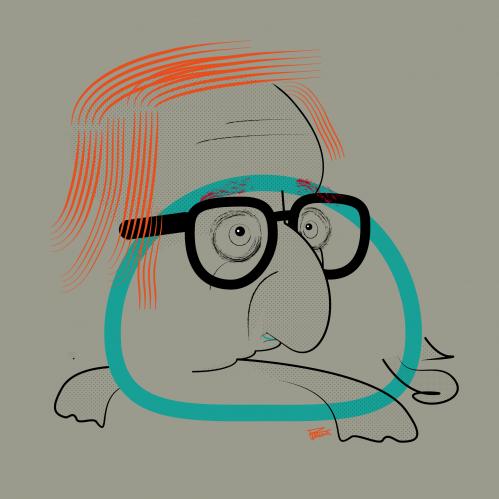
Michele Rocchetti is a young artist from Macerata (Italy), who is still in art school. A couple of weeks ago, I stumbled upon his “Hollywood Bestiary” – a collection of vectorized portraits of actors-as-animals. To me, these caricatures present an interesting combination of clear line drawings and geometric shapes: reminiscent of classic pen-and-paper caricatures but at the same time clearly digital.
![]() Michele, all of your work on toonpool.com was done with vector graphic programs. Do you use “classic” hardware at all?
Michele, all of your work on toonpool.com was done with vector graphic programs. Do you use “classic” hardware at all?
Usually I make some chaotic sketches with a pen: during school lessons, before going to sleep or when I’m sitting at my computer. It’s the fastest way to collect ideas and to find a point to start from.
Is there something special about working with vectors that couldn’t be done without a computer?
This is a hard question… I think that if vectors make a difference, it is because the final product, the original work, is more “ductile”, due to its digital nature. This means that you can experiment with various kinds of filters and printing methods and still have perfect, clear lines and shapes.
Finally, I believe it’s a different approach, a different way to think. I think it’s wrong to try to use vectors so as to make a fake copy of traditional techniques. The final print must have consistency, you must be able to see its digital soul.
 Could you explain the way working with vectors allows for a different way of thinking?
I think that working with vectors is closer to graphic design than it is to traditional painting. You are not constricted by a specific size since you can print our works in any format without quality downgrade. Also you can easily transform an illustration into an animation.
What is it you are trying to do in your Hollywood Bestiary project?
Hollywood Bestiary was born as an exam project. Actually it’s a more complex work with specific narrative parts for each character. What I’ve published on toonpool.com is only the illustration element.The project is based on medieval physiognomic theories about the similitude between people’s behavior and the way they physically resemble specific animals. Personally I don’t believe that these theories are credible but I find them very funny and interesting.
I chose Hollywood characters in order to have a smaller thematic range, but I went on from there and maybe I’ll continue with others subjects. For example I just added animalized portraits of Alice Cooper and Bob Dylan.
For influences you mentioned Al Hirschfeld. What is it about his portraits that you like most?
 I found Al Hirschfeld by chance: I love traditional rock and have always been impressed by Aerosmith’s portrait on “Draw the Line”. Last spring I looked up the artist and found Al Hirschfeld’s name.
In my opinion Hirschfeld is the finest of all famous caricaturists in the world. His perfect use of the pen, the light, fluid lines that contrast with the decorative textures for clothes, and the classic fine atmosphere of his works are unique.
My favorite caricatures are his Frank Sinatra portrait and the portrait of Woody Allen and Diane Keaton in Annie Hall – also one of my favorite movies. I think there is a kind of similarity between Al Hirschfeld and Woody Allen in the way they describe society and stereotypes.
Do you use something you’ve learned from Hirschfeld for your Hollywood portraits? Or, the other way around, is there something you can do with vectors that he couldn’t do with a pen?
I try to use something he has taught me in all of my works, not only in the bestiary project – his delicate and free way of drawing. I hope that with my means, that is with vector drawings, I’ll someday achieve something he did not: I’ll become a rock star.
Thanks for your time!
Click here to read part 2 of the vector special.
Paul Hellmich
© toonpool.comTags: Al Hirschfeld, Michael Rocchetta, Michele Rocchetti, vector, vektor


“I think it’s wrong to try to use vectors so as to make a fake copy of traditional techniques.”
I totally agree – vector applications are often misused. Michele created a style which is a kind of it’s own. Congratulations!
Thank you Paul for the interview and thanx for the comments!
[...] Click here to read part 1 of the vector special. [...]